
 EN
EN

World E To Launches New Logo, Embarking on a New Journey of “Chinese Technology, Empowering the World”
We are pleased to announce the official launch of our new company logo. The new logo is designed around the core letters “W” and “E” from World E To, presenting our global vision and brand philosophy through a simple, modern, and distinctive design.
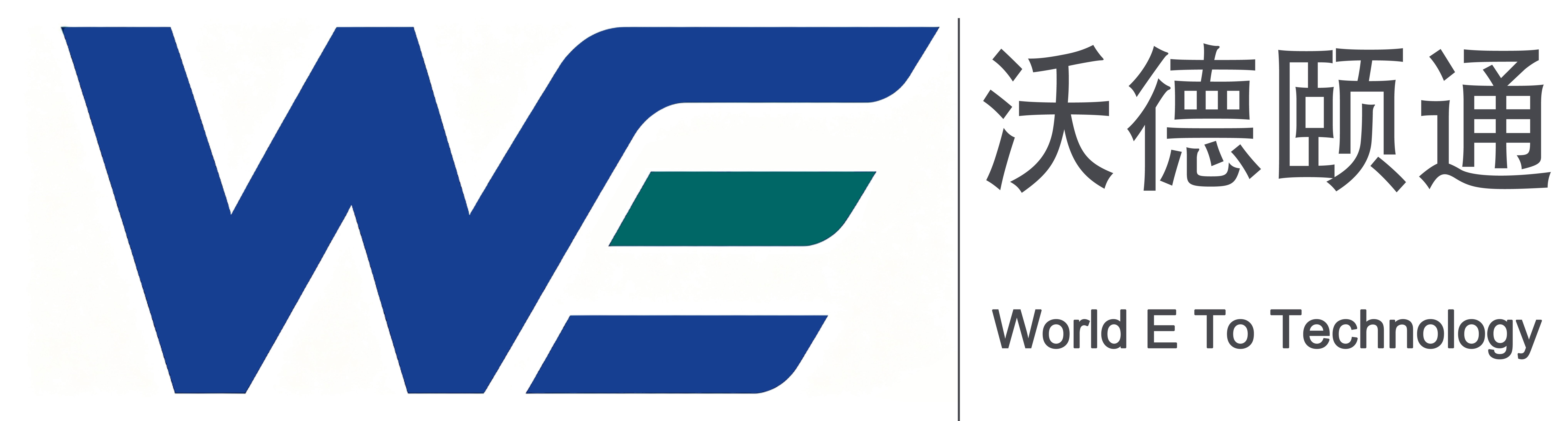
The letter “W” (World) represents our commitment to serving customers worldwide. It reflects our vision of connecting Chinese technology with global markets and providing reliable products and professional services to customers around the world. The letter “E” (Easy) represents convenience and accessibility, symbolizing our efforts to make high-quality products and services easier to reach our global customers through efficient supply chain management and professional support.
The new logo features blue and green as the primary brand colors. Blue represents technology, innovation, and professionalism, reflecting our continuous pursuit of advanced technologies and high-quality products. Green represents energy saving, efficiency, and sustainable development, highlighting our commitment to promoting efficient and environmentally friendly technologies in the fields of power electronics and industrial applications.
Since its establishment, World E To has always adhered to the philosophy of “Chinese Technology, Serving the World”. We are committed to providing global customers with reliable products made in China and ensuring a secure, efficient, and stable supply chain.
Looking ahead, we will continue to embrace the mission of “Chinese Technology, Empowering the World”, leveraging China’s technological capabilities and industrial strengths to deliver higher-quality products and services to our customers worldwide.
With our new brand identity, World E To will continue to work together with global partners to create greater value through innovation, reliability, and professional service.